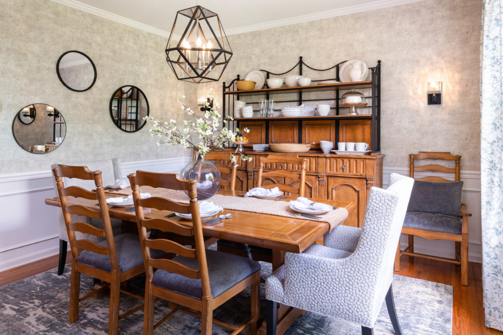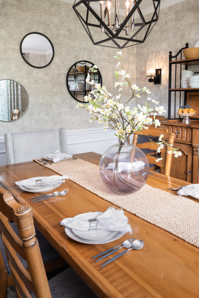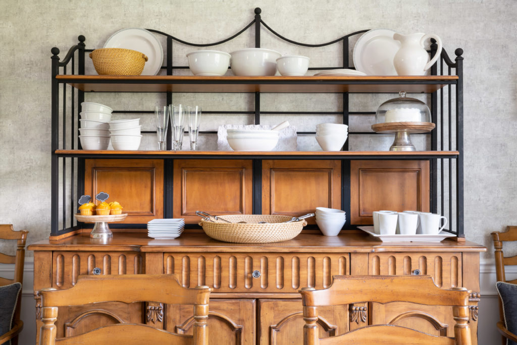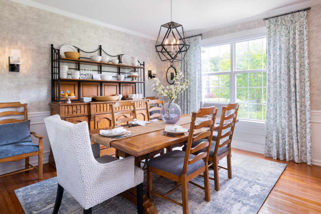
It’s time to reveal the space for the Spring 2020 One Room Challenge. Thank you for following along with me on this journey – what a wild ride it’s been! I’ve given my humble dining room a much needed refresh into a modern farmhouse haven!
When I started, here’s what I set out to achieve:
- Install Shadowboxes
- Re-paint walls
- Add wallpaper
- Add a rug under the table
- Keep hutch and table
- Install new window treatments
- Add a new interesting piece of furniture
- Change all lighting fixtures and sconces
- Reupholster the seats
- Add some fun hostess chairs
- Add new accessories and artwork
COVID19 was a major factor going into redesigning the room, and put some major stress on sourcing items, availability, and delivery times. NJ was one of the states to completely shut down early on. This meant that not only did I have to make my design decisions really quickly, I also had to make sure all my business connections would be able to help me execute the work. Yikes!
Yes, I had many little hiccups along the way as with most projects but a couple of Hail Mary’s and deep breaths helped and saved me. As they say – you can’t rush perfection!

The first thing I knew I wanted to do was update my chairs. So, I sent them off to get re-upholstered and with COVID restrictions, having them completed and delivered came down to the wire. But, they made it and they look absolutely perfect! The team at JH Dinettes Freehold did an amazing job at updating them from the bright, blue seat they originally had. I added in a custom pillow and they look luscious and just so much richer. The fabrics for the chairs – both the hostess and the dining – comes from Kasmir and really ties the room all together.
I had to switch up my approach with the shadow boxes, changing from the original design and aesthetic that I had originally chosen. The reason for this being was a spacing issue – what I had selected just wasn’t going to fit or work out with the room layout and the chair rail that was already in place. A big shout out and thank you to Cucuro Contracting for installing them and the wallpaper so beautifully!
The rug was another little bump in the road! The rug I originally picked out in week 2 was all of a sudden on backorder which sent me into a stress spiral. When I went to select a new one, I wasn’t able to see samples, so just had to trust my gut. I ended up ordering 3 (just to be safe) and the second one of the 3 was just PERFECT I honestly can’t even imagine the room with out it!

I’m so happy to finally have window treatments up – that is a job that has been on going for a few years now (the fixtures from the last time we revamped the room are still in the wall, but they were never installed!)
Initially, I set out to purchase another piece of furniture to replace the older side console that was already in the room. I soon decided that the vintage piece I already had would work perfectly with a bit of a makeover. So, I painted the details matte black to tie in with the hutch, leaving the doors and top of it honey brown. I also added in gorgeous new hardware to give it that extra bit of glam.
My sweet vintage hutch got a little makeover too. I added new fixtures (that match the revamped side console) and also added some fresh black paint on the metal details to give it a modern update and tie in with the lighting fixtures.
Accessorizing the room is always a big part of finishing the space – I focused on pieces mainly for the hutch and the table, and found everything I needed at Crate and Barrel. I opted for rustic, white pieces to display on the hutch. The plates and china have little imperfections and impurities, but that’s all part of the charm – I wanted it to feel like a real farmhouse hutch. Also, I couldn’t pass up gorgeous dessert displays and sweet accent pieces like rustic metal serve ware and wooden cake displays to add that little bit of charm! The matte black cutlery is probably one of my favorite elements – it looks very modern and I also just love they way they feel when you hold them in your hands. For the table, a woven rattan runner and a floral accent piece adds the final touch!

When it comes to accessorizing, you can’t forget the walls! My mirror gallery wall adds a little modern vibe to the space. I loved the idea of a gallery wall, but wanted to do something that felt fresh and just a little bit edgy. So, I chose a selection of 3 mirrors with contemporary frames that I installed. I also flanked the window treatments with two other oval mirrors to keep the theme going.
All in all, I think my vintage hutch and dining table look happy and complete in their new surroundings – I absolutely adore this space and can’t wait to host many dinners in this room for years to come!
This has been such an amazing journey – a big thank you to the One Room Challenge media sponsor, Better Homes and Gardens and congratulations to all the other One Room Challenge participants!


